To contact Kat drop her a line at katguevara@ymail.com

Monday, October 18, 2010

Four Horsemen: WIP


For CGHub's challenge, the Four Horsemen. My rendition is of them as almost historical figures. Conquest is a Legionaire, War is a Red Coat, Death is a Nazi Solider, Famine is a Spanish Conquistador.

I blocked some type in of phrases I want to at least in part add into the image...kinda like when I added type into that watercolor mixed media portrait I did a few months ago. Things are pretty loose right now, there are still some things to add in before I start to render.


Started to add some color to get a feel for this. Actually, I rather like the way the horses mimic watercolor. Hopefully the rest of the piece stays as coherent.


Still working on it....actually, this is the first time I've gotten as many compliments on CGhub for one of my entries. Now I really HAVE to finish it.


Quick update. Dropped this image into grey tone to get a better sense of where this headed. I've been doing this a lot to see where I am lacking in tone since color saturation can look like there is tone when in reality it doesn't exist. 

Anyways, the tab;et's been acting kinda weird despite reinstalling the drivers and resetting my pref's. No idea what's up with it. This is Due on Halloween and I still have a ways to go.


Right, so...the tablet seems to be working once more finally. And been talking about this piece with some friends. Lucas suggested, among a few others, to just drop it into grey tone and finish the render, then add a photo filter and some color to it. So with only a few days left that is the plan. Fingers crossed!


Still going.....


Sunday, October 17, 2010

Just....Sketching


Sometimes frustration really hits you out of no where and lingers for far longer than you can imagine. Right now I feel awkward about my artwork and where it is going as of late. Been looking through my sketchbooks from high school all the way up to the last plain air watercolor studies I did in college.

Sometimes it's helpful to do things like that, see how much you have improved over the years, see where your struggles have shifted. See where you finally got courage to do new things. And see what it was that you loved to do the most.

For me it was free pen sketches in my sketch book, on rolls of receipt paper from when I was waiting tables, on napkins at bars. Just sketches that you let flow out of you.

Here's one I did today. It's not perfect, it didn't have to be. I did it on the computer...sad to say I miss my watercolor block and actual painting. I just haven't gotten into the mood to pick up an actual brush and spread it around on paper.

I know I'm very dependent on line but, well, it's kinda something I enjoy, the sketching that I do, more than anything else. Lately I feel so anxious, and awkward about all the art I am making for one reason or another. Even now I keep thinking that I was able to do this drawing yet I haven't been able to get into the sketch I am doing with Raven at all, or the D&D screen I need to finish in the next couple of weeks.

Guess....I'm just feeling like I am losing myself more and more these days with what it is I want anymore, or what it is I do. I thought I knew but....now I'm not so sure. I question things all the time, which is no good, and those sorts of things I think show through in what I am doing. People say to follow your heart and do what you love the best, but what if you don't want that to be your down and dirty work?

For along time I have struggled to pull the way I draw together with the way I paint. Just like the levels of doneness when I draw...cartoony or realistic.....I seem to fall into an area where it doesn't look right. Like I need to be at one end or the other....I just can't seem to compromise.


I'm not sure how I feel about working digitally....I think it's one reason I keep using it. I like sketching digitally to a point, but I don't really like coloring I think. Some things are nice about it. In the colored version of this I like the rendering in the face and parts of the veil because it almost reminds me of a wash of colors. But...it's still not the same. I want to print this out and color her by hand, but no scanner at the moment or printer.

Thinking about just doing some personal pieces during the spare time I have, between my other little projects I have going on. Just let it out, see what happens, and try not to really think about it's application so much, or anything of the like. This image certainly was unexpected, not something I ever have rendered before...

Anyways, I'm just caught up in the madness of my own self right now. I'm not too happy with a lot of things I am working on, and I dunno what is gonna happen in the short term or the long run, but I don't think I will be able to put my art aside irregardless of how much it hurts to think about what I am doing about it.

BTW...That is me.


Saturday, October 16, 2010

Sketching with Raven....And some Frustrations


So, I haven't tinkered around much on any of my projects lately. My hand has been hurting a lot, I am guessing it has something to do with my recent use of the wacom tablet a lot more than I am used to.

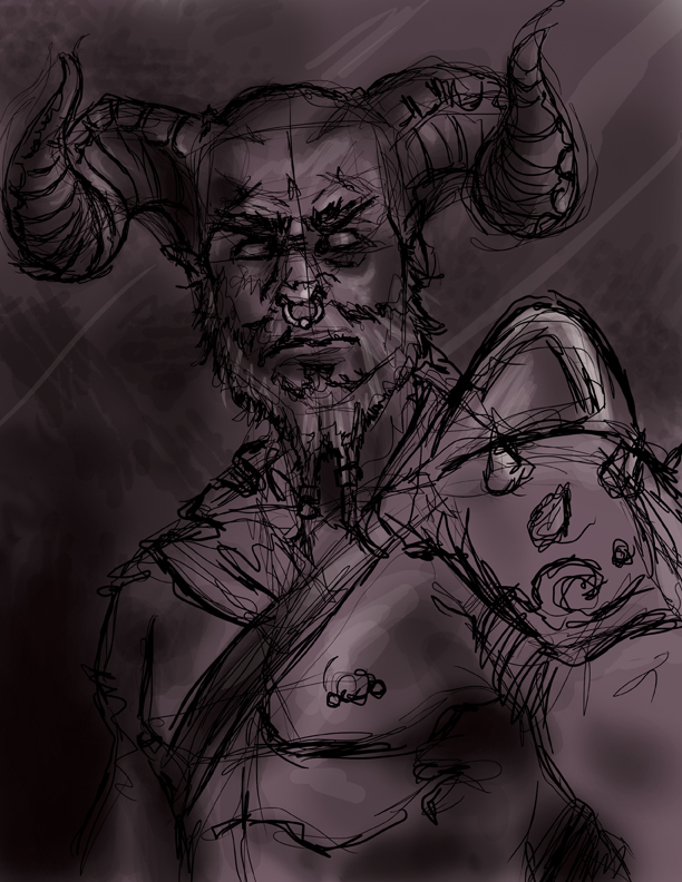
Regardless, Raven Mimura has been working on helping me to figure out men in my artwork, starting with what will be a series of exercises. This one is the first. I started to add some color to the rough sketch, keeping in ming what he had said about making sure I don't soften up the edges but....

While this doesn't look like one of my ladies, I don't think I am doing a god job on this exercise at all. Some people pointed out that some things are wrong with the drawing, like the perspective of the horns. And also that I lack any lighting.

I would think that spending 5 years in college I would know  better by now but I guess I don't.

A fellow artist over on ArtOrder took a look at where I am at right now and did a paint over of the image to show me what I am lacking right now.
Paint Over done by Lake Hurwitz

I can clearly see what he means by his representation of what it is I am lacking. I also see how someone else approaches a piece...which kinda leads me to question what it is I am doing.

Aside from that a couple of other things have kind of bummed me out lately. It's a bit hard to get into any of the projects that I have started to work on at all, since I can see in my own work how some of the frustrations are showing up. Right now in my sketch I keep thinking that adding color tones in doesn't really do much to help out or mask things, I am aware I need to go in and fix things.

I have a bad tendency to over scrutinize when I start to step out of the pencil stage. Thinking back on my watercolor advanced course, maybe I just need to treat this as a gesture and not as a drawing I am really going to take to finish.

I dunno, I'm feeling a bit lost at the moment. I think I need to sleep on it, have a cup of tea, and massage my hand, then have another go at this.


Wednesday, October 13, 2010

Knights of The Dragon: Dungeon Master's Screen WIP

So, a friend of mine commissioned me a few months ago to do a two panel screen to be used as a dungeon's master screen for an ongoing RPG campaign. In between working on other projects I have been tinkering around a lot with some concepts and am starting to get antsy since he wants this before Thanksgiving weekend (which is only a few weeks away).

This concept has been a hassle since the is so much in it and one of the biggest issues was that the right side and left side actions were competing for focus, and everything kept pointing out of the corners and leading the viewer's eyes out of the chaos of the piece.

Here is the description of the piece I was given.

We would be looking for at least 2 full-color panels of a 4-panel screen, 8.5" X 11" (we will likely put city/county maps on the outermost panels, although depending upon what your feedback, that might change).
These two panels will be 'busy'.
On the left hand panel, a band of six torch-bearing & weapon wielding youthful adventurers (the typical generic lot:  halfling rogue, half-orc barbarian, dwarven fighter, elven ranger, human cleric, gnome sorcerer; or some variation on that theme) descend a flight of stone stairs into a crypt.  Pulling themselves up through the stone floor of the crypt to confront them are zombies and skeletons (in some cases all you can see are their heads & hands, others are emerged to the torso, others are pulling their trailing foot free).
On the opposing panel, a late-middle aged human cleric of St. Cuthbert in full plate & towering, light-emitting mitre; and a chainmail-wearing paladin in his prime, also of St. Cuthbert; square off against a greater mummy, at least 4 lesser mummies, and a horde of zombies & skeletons.

So the size of a two panel piece is 11x17 inches. After a lot of tinkering I looked at this as a book jacket piece, where the front and back would have to make sense if seen at the same time.


The issue that I am running into now is there is no room for the type and there aren't really any monsters left in the piece at all. It's been nothing short of frustrating, and it seems that no matter what I do something is wrong.   I had to chop out a lot of what was originally asked for because I couldn't fit everything in and have it not be something you automatically wanted to avert your eyes from.

Of the sketches, this is the closest to something workable I have.

Tuesday, October 12, 2010

Artist Challenge: Exercise One WIP

So, I have a weakness for men. No, it's not quite what you think though I do enjoy their company and just about everything else about them. What I mean is that I have a weakness when it comes to depicting men in my artwork. They have a tendency to come out feminine without a good reference, and even with one I seem to soften them up quite a bit.

At Gen Con this past Summer I had the pleasure of speaking to an artist I have admired for quite some time now, and recently he offered up a challenge to kick my butt into gear when it came to drawing dudes. Of course I accepted!

I got an email today of a reference photo that he chose since he has a better eye for things. This is it:


Yumm.....I mean, ok. Moving on.

This is the pic he chose cause he is a manly man. He told me to try to focus in on a profile here so this is what happened.


In Photoshop with my tablet (sigh, which seems to be best buddies with my travel pallet now) I began a sketch of a profile. Part of the challenge here is to keep away from my love of curved lines, and to play around a bit. He told me to try making the man candy into a zombie, pirate, or something else that was rougher and less....cheesecake. 


With the line work down I kept going just like if this were something in my sketchbook. I thickened and darkened up my lines knowing that I was probably going to try putting this piece in something close to greyscale. 


Ok, so this is now 20-30 minutes into the exercise and I am deciding to pause here so that I can get some feedback from the artist. Actually, I have to admit looking at this now that I haven't done this kind of thing since oh...I dunno, some time in college. Actually my first year meeting the artist at Gen Con he mentioned dropping art into greyscale to see how it was coming. Invaluable advice I have been following since then though I don't tend to do it this early on.

I like that this reminds me of a marker comp I might have done with traditional markers on cheap watercolor paper with some colored pencil for highlights. So far in this has been fun. And as for the time spent, well, I think that is force of habit for me really. I am used to getting roughs our quick...it's what I am trained for =]

So, stay tuned for more details on how this piece come out!


Saturday, October 9, 2010

It's Good To Be A Princess: WIP

Working out some ideas for T-Shirts to sell in the future at conventions. I came up with an idea for a cool Princess t-shirt, using Leia, Dejah, and Xena (all kick butt princesses!). It's cool to work with iconic figures that I haven't tried to draw ever before. Here's a sneak peek at the design so far.


They aren't old enough to realize how kick butt these ladies are....well...maybe they know Leia.....but I am hoping that my friend's two daughters will wear a shirt for me cause that would be rad! Yeah...can't wait to wear one myself!

Wednesday, October 6, 2010

Jynx: Tattoo Sleeve?

"What did you think I meant when I said blow job!?!"

So, I started doodling Jynx at close to midnight cause I had a thought that she would be a flippin' sweet tattoo sleeve! Not that I can afford that at the moment, but some day it will become a reality. Right now I'm just working out some compositions. I really like the way this sketch is looking thought I think I need to add another trooper helmet and do something about the symbol behind her. 

Jon posted up a t-shirt challenge on ArtOrder....I already use Jynx as my mascot and have been wanting to paint her onto a button up shirt I have (like a greaser would wear) and a jacket I have. So I figured why not also make her into something that could be tattoo art or even a temp tattoo or sticker?

I still have some clean up to the lines to do and some other work too. I want to put some type in but am not sure about it yet.