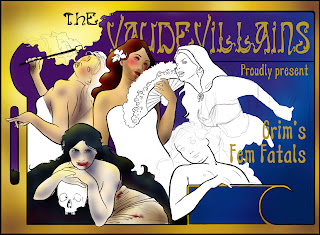
So, despite still having commission #3 to finish up for Cyptic Strudio I decided to enter....or try to enter, into another CGHyb challenge. The premise is a weird freak show of sorts. There was a comment about Siamese twins with a chainsaw and a wolf man, but I asked if we had to include those and was told not really.
My idea is inspired by Alfons Mucha. I looked at some of his work as well as some old posters from Barnum and Bailey, and some freak shows and vaudeville posters from way back when. It kinda hit me to try out a twist on a theme, so I went with fairy tale maidens. But instead of being the damsels in distress they are more like the femme fatals I love so much in old pulp fiction stories.
I started the sketch out in Photoshop. After finishing the last piece in this media I decided why not try it out again and do things a little differently? Besides, I am still painting a lot for the other commissions I have.
I still want to add in some type to suggest a little bit more that this is a poster for a freak show talent. The ladies are all insane cougars of course....of course. The Fire eater is supposed to be like a Cinderella (I keep thinking this stupid phrase 'Cinderella dressed in chrome, burned her lover to his bones). The lady in the bottom left is Snow White and is going to be a cross between a vamp and an albino (researching freak shows it seemed that any oddity made it into the show). The woman in the center was going to be the Bloody Belle, but that became an issue since Little Red is leaning towards her. So I changed the middle figure up to being the Bearded Belle instead. Little Red is leaning in and is gonna be like a cannibal or Lizzie Borden (on account of the ax behind her back), and the last figure is going to be a take of the frog princess, or little mermaid.
There are some details that need to be added in still, some decorative flowers and what not before I start to color it in. So far I am happy with this piece. The due date is the 7th of October...only one week! But...I know I can get this done. It'll be a nice piece in my portfolio.
Ok, it's super late now. I just wanted to post up one more progress pic before I hit the sack. I started to color the image in (sometimes it helps me work out last minute kinks. Right now I am liking the color scheme and can see how my original idea for a color layout is going to work. However I think it needs more of a creepy feel to it so I plan to add in some darker colors here and there, perhaps some wear and tear once I am done. Kinda like aging a piece.
Already I can see a big difference as opposed to my tata piece I just finished. I am using a lot of airbrush in photoshop to get the feel I want from the old fashioned posters. I think it's appropriate for this type of image.
I am also noticing the type is disappearing. I kinda figured it would....not gonna say what I plan to do with it just yet. It's fun working on this and I am surprised I have as much of it done as I already do.
Well...time to get some sleep. Yawn.
Day three (ok day 2 and a half really). Been working for about an hour or so on this now along with doing some other things. I'm still liking how this piece is coming along. Still need to add some creepiness to the ladies. Right now the bearded lady with her five o'clock shadow is creeping me out the most. I think she looks like Jesus in drag giving me a sultry glance over the top of that fan, which makes working on Red Ridding Hood hard.
I've been thinking a lot more about the type and searching out some reference materials for flowers to add into the bottom two corners. I still want to add in some roses on the lower left near Snow White, and some water plants on the lower left by the Frog Princess.
Not a lot of other people getting in on this challenge on CGHub so far, probably due to the shorted deadline this time around. I'm gonna just keep updating this post in particular....I like it this way and it's my blog so I can do whatever I want! =p
Day three. I haven't spent to much time working on this piece over the weekend. And I am a little flustered to find that some of my custom brushes have gone AWOL. I blame the gremlins....
That aside...this piece is looking awfully bright and chipper. I think it has a lot to do with the colors and the fact that my villainesses don't look so...wicked. Little Red and Snow White look a little more macabre than the others but that has to do with the blood I think. I might have to go in and add some weapons...but I wanted them to be like the cougars of the carnival. O well, you win some you lose some. Overall I am pretty happy that I was able to do something outside of my comfort zone even if I am falling a bit flat.


1 comment:
Kat! I love this one so far!
Post a Comment