To contact Kat drop her a line at katguevara@ymail.com

Sunday, November 28, 2010

traeH yM ekorB uoY: WIP


Started a self portrait today in photoshop. I have an old ref I used and tweeked a little bit, then added the moon jellies in (I like jelllies). 


Droped a grey layer onto and worked directly on it to start getting some values down. Using a watercolor brush in photoshop. 


 Just about done for now, keep going later on.


Starting to add some color to this piece. I like it and I don't. Still using a watercolor brush. I like some of the strokes that show through cause it reminds me a little of actual traditional work (like when you dry brush in watercolors) but at the same time I don't like it. 

I might do two versions of this, one a continuation of the process I've already started, and one just flat colors over my line work. We'll see what happens. 

Sketching With Raven: Study 1


So, I ought to have posted this sooner. The sketch I was doing as a man study of that beef cake picture for Raven is now up. I guess for a study it's ok. Drawing men is out of my comfort zone as well as rendering on the computer but some things I have to get over. 

So, here's one of what is going to be a line of studies. 

Saturday, November 20, 2010

What Did You Think I meant!?! WIP

So, I was going to enter into a Pokemon challenge over at http://cghub.com/ and I even did a sketch and posted one BUT then I saw that there was a pin-up challenge going on as well and....well....pokemon vs pin-up....pin-up won.

Step 1 Pencil

Since the pin-up challenge is due on the 28th of this month and I am working on other projects I decided to recycle and image I already had. Remember the one I did for the t-shirt challenge last month? I took that image and revamped it, doing a light pencil in photoshop. 

Step 2 Ink
When that was done I started to digitally ink the piece in. Let me say here and now that I don't like how inking on the computer turns out for me, but it's something I need to practice on more. Anyways...I did the above piece which reminded me a lot of a coloring book page....a naughty one. 


Step 3 Colors
And then I started to color it, starting with the skin tone and the colors I normally use when I am doodling Jynx....pink and black. I use flat colors and a round brush set at a light opacity, as well as one of the watercolor brushes set to a light opacity as well. 


Finished!

And the finished piece. I started this at....oh...2p.m. today and finished it at 11p.m. A quick turn around piece. It feels good just to get a piece out even if I don't think it's as great as it could be. Sometimes just getting it done is the reward. Anyways...ta da! Nothing else to say about it really....

Thursday, November 18, 2010

First Day Jitters: A Process

It occurs to me at odd hours of the night how much I enjoy process work and how I find it to be relaxing. Don't ask me why, it just does. 

I need to think about something that is not related to my Dungeon Delve piece or my Knights of The Dragon, so I was looking through my work and found this process piece that hasn't been explored yet. So I will post it here now to show you how I think and how I recycle my art.

Stage 1 Thumbnails
First of all....this piece was done in my Editorial Illustration class and was assigned by one of my favorite instructors Rich Kryczka. We were given a few ideas to work with (I can't recall since this was a while ago) and I did a couple of thumbnails in my sketchbook. Obviously I stuck with the one at the top left (I hate it when I pick the first thumbnail I did, which happens a lot more than you would think).


Stage 2 Pencil Rough
Stage two was to clarify that idea a bit. I drew this kinda freaky looking pencil to be approved by Rich before moving onto the final pencil stage. We are given 2 weeks to finish a piece from start to finish in class. 


Stage 3 Pencil Final
I sat down with Rich and was ready to go! One stage that is missing (thought I couldn't count huh?) is the color composition stage. Normally I don't do these as often as I should anymore unless a client request seeing a sample pallet, or I am having issues thinking in terms of color. I xeroxed the pencil above at 20% and did 3-4 color combinations. 


Stage 5 Finished Illustration
Moving along to the finished illustration. During the color stage it was actually pointed out that the tension wasn't coming off the way I wanted, so we changed the backpack's expression to help convey what I was after. I did the final image on arches hot press watercolor paper 140 lbs. Dimensions are 8.5x11 inches, in watercolor, ink, and colored pencils.


Bonus Stage Design Layout
But wait! There's more!!! To show how an illustration like this was intended to be used I found an article online and copied it into a page layout format. While I need to work on placement of type (as in those paragraphs are horrible) it shows how my image works in relation to an actual page layout. I sampled colors from the image to use in the type.  


Bonus Stage Working Type
And made another page to show how I can keep tying things in with color. It was a fun piece to work on and while normally someone else would be creating the page layout it shows that I can, and that this piece could very well fit into something like Family Circle without too much of a problem (but for that type). 

Anyways....wasn't that magical!?!

Tuesday, November 16, 2010

Dungeon Delve: WIP

Jon posted a challenge over on Art Order for a Dungeon Delve, depicting a lost and weary traveler inside of some kind of dungeon or space. I've been working on this for weeks and it's been proving to be a difficult challenge for me. 


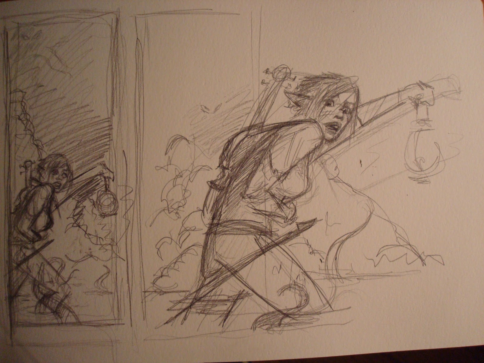
Above is one of my original sketches. I did a bunch to try to figure out what I was going to do but this is the one that I settled on because I liked it the most. The original character was a bard....I didn't have a race in mind really but I was juggling between an elf and a gnome. 


After a while I did a grey tone comp to see what I was really working with, changing up the composition a little bit. I really like how this turned out but there are a lot of issues with the anatomy of my figure and not any detail shows through. 


I decided at this point I wanted to do a gnome, which proved to be a lot more difficult than I imagined. Their proportions are different and I kept drawing more accurate proportions for a human and 'tooning' the image the way I do with my pin ups sometimes. In the end I began to really hate what I was doing so I decided to leave it alone and come back to it. 


After taking a break for a day or two and working on my other dungeon piece (Knights of The Dragon), I came back to this. I got my sister to shoot some reference photos of me to help me out with the anatomy and scraped the idea to make my bard a gnome for the sake of getting out a piece I could be happy with. Don't worry....I will  do a gnome piece in the future just to prove to myself that I can.

While I like this sketch a lot more I need to push it still. I am not happy with the perspective here and am not sure how I feel about the angel head in the foreground.


I showed the composition around and made a few changes to the scene, keeping my figure the same. I changed the head in the foreground and the angels in the background. I do plan to get fairly dark with this piece....once I am happy with my sketch I will render a grey tone and then go into color. I have my pallet selected already....keeping it simple. 


Quick grey tone comp to figure out my lighting....I want this to be dark. I'm not sold on my water just yet and think I need some rim light (reflected light) to pop my lost bard out a bit more. 


Well....it couldn't last forever I suppose. Man, I really hate coloring digitally....at least over grey tone. I am thinking of going back to the original pencil before the grey tone and building up my colors like I would in watercolor cause working dark to light here is really messing me up. And look at that pallet! What the heck am I thinking!?!


I am finding it very VERY hard to paint over a grey tone drawing. I got so frustrated that I copied my image and started rendering over white. It's going better a bit, I still have my grey tone up to look at but I am still feeling frustrated with my piece and am thinking of adjusting the pallet a bit to the one I tend to use a bit more: violet, sienna, and a bit of yellow. 

Below are some of the 'references' that I am using on this piece. I have a mood board set up  of images to help me out with what it is I plan to do. (A mood board is like a collage of images that carries a vibe to it.)


Some things I am looking at are form and surface texture I plan to use....statues have some great things going on with them in age and weather....


Picture of some weird dorkwad in her pj's trying not to laugh at herself....


I put these images up (above and below) because I didn't realize how useful they would ever be. The above was a study I did of white on white but I am looking at the way that light effects the stone. The bottom image is a pic I took and painted a doodle of for no reason, but I find I keep looking at both the picture and the watercolor I did while rendering my current piece. 


Monday, November 8, 2010

Knights Of The Dragon: WIP Pencils

Ok, so I have round about two weeks to paint this up for a friend. Here's a look at how the Dungeons & Dragons game screen is coming along so far. 


Working on 140lb hot press arches watercolor paper at 11x17inches. Right now I am still laying in some of the pencil work though I am going to leave it looser than I normally do since once I start putting the paint down the pencil lines will disappear. I left room for type at the bottom which is blocked in in pencil at the moment but will be done digitally. 


A look at the right hand panel. I still have quite a few zombies and what not to add in here. Painting in the armor is going to one challenge for me since it's something I tend to stay away from. This piece is chalk full of things that are outside of my comfort zone. 


And the left hand panel. This has actually been harder of the two sides to draw in for me perhaps because of the focus on the guys in armor. I plan to let a lot of the paint do the beefy part of the work for me. So....keeps your fingers crossed cause I'm gonna need all the luck I can get. 


Wednesday, November 3, 2010

Painting For The Sake Of It

I came across of a bit of scrap watercolor paper today....


 And a photograph I took last summer of the fountain outside of the Art Institute of Chicago....


And before I knew it the two became one, merged together in pen and paint...


For no particular reason at all....


A painting emerged.....


And this is what it was in the end.....


And also, in the beginning before one art became another. 

Monday, November 1, 2010

Welcome To The Land Of Dust Bunnies

Cleaned up the room a bit today since it was getting cluttered. I've been working a lot in the living room of the house but find that there are way too many distractions down there to get any real work done so I am relocating back to the room/ studio.

Can you guess what my favorite color is?
So, this is where some of the magic happens, though I need to get better lighting. This is the main art corner of the room where most of the good stuff happens. Yes, that is a rapier hanging on the wall...

Where I work digitally
It's nice to have a computer station right next to where I do the real painting so that I can just gance back and forth while I work if I am using reference materials. 

Boba keeps me on my toes
I am a HUGE Star Wars nut....I have Boba and Han on opposite sides of the computer and yes....a dragon duckie lurking back there. 

A more traditional desk
My main desk and the easel I only use on rare alignments of the planets. 

Some of the ol' studies
Getting ready to hang some of these up on the wall for reference in the future. I learned a lot from these in their imperfections. 


So....that's about it for now I guess.....back to work.